Fortis Group


Overview
- Year
- 2019
- Agency
- 42 North
- Team
- Project Manager
What is Fortis Group?
Fortis Group is a general contracting company with over 40 years of experience in the construction industry. They work in a variety of sectors with clients spanning institutional, commercial, industrial, recreational and residential industries. They are known for their experience, reputation and innovation in communities they operate in.
The Project
Redesign and develop the Fortis Group website.
The Brief
Context
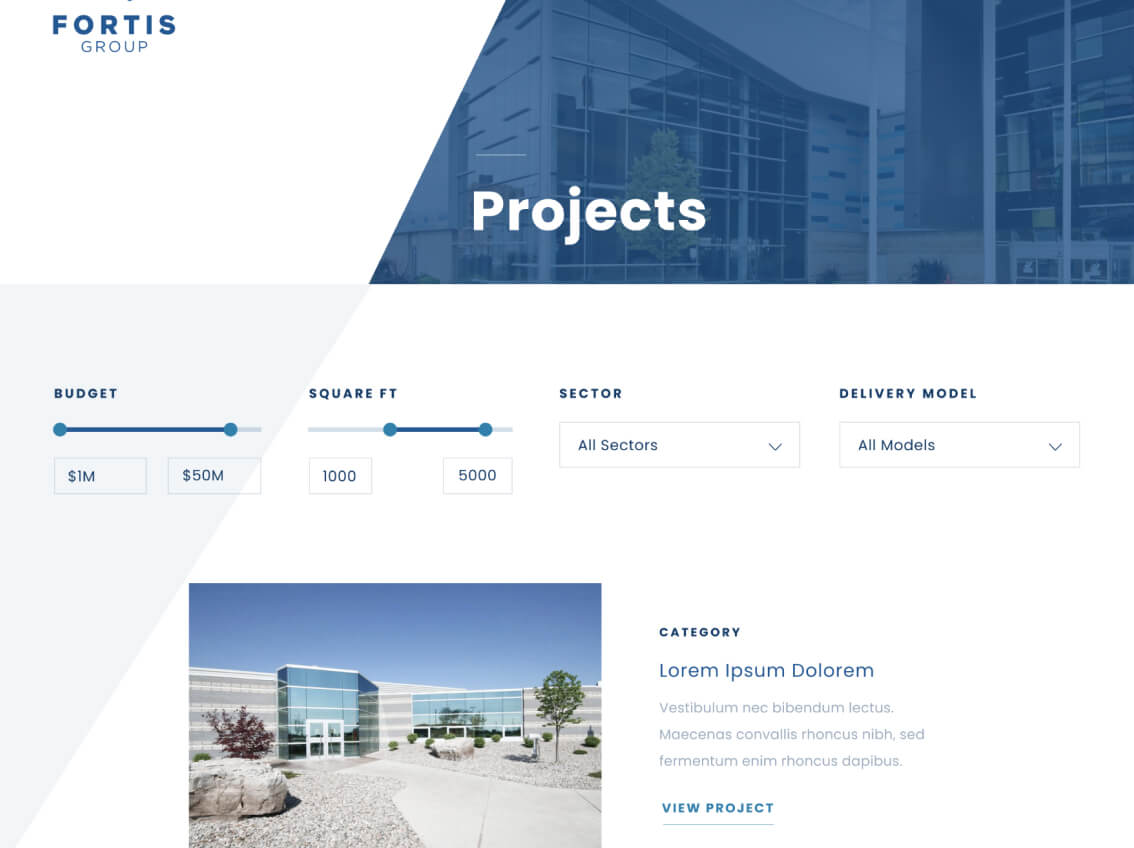
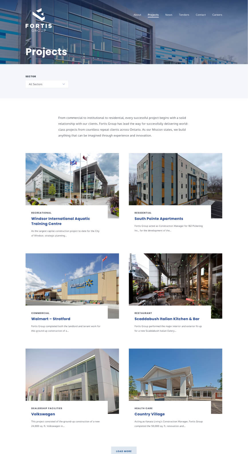
Fortis Group was looking to freshen up their site. Their site was starting to look dated, particularly when compared to their competitors' sites. Many of their competitors recently updated their sites to more modern designs underscoring their work. This was an area they were seeking to improve, as their existing projects page displayed low quality images of their construction projects with little to no detail. Additionally, their site was an odd hybrid as a static site using the Kirby CMS mainly for cleaner urls. This back-end architecture was confusing and made the site difficult to maintain and update.
Goals
- Distinguish from competition while striving for clean and modern look
- Improve presentation of work projects
- Create an easier to manage back-end
Guiding Keywords
From this brief and conversations with stakeholders we captured these keywords to use as our focus throughout all phases of the project:
- Modern
- Innovative
- Impressive
- Easy-to-use
- Sleek
- Trustworthy
The Process
Content
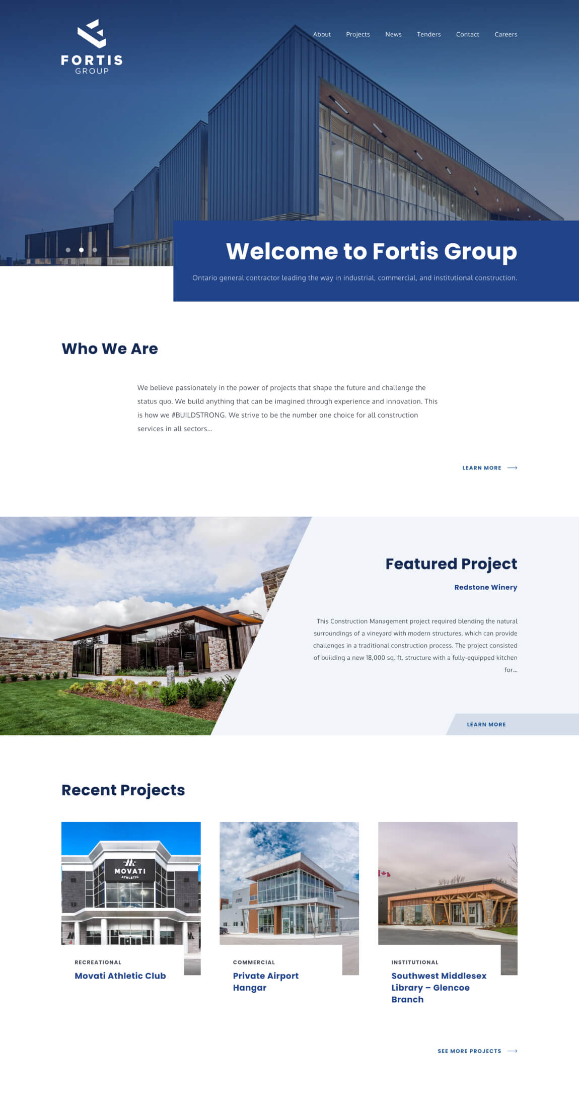
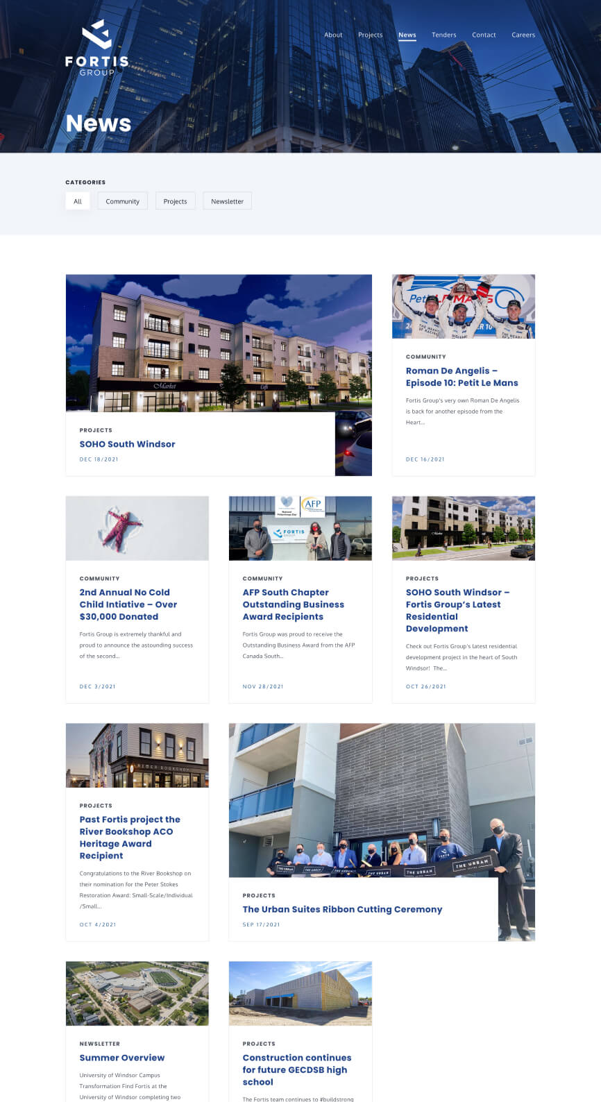
We started off creating a sitemap of their existing navigation structure and collaborated with their marketing team to add and remove pages as needed. For example, tenders were introduced as a new page and custom post type that would be needed for the site and their community page was removed as it was merging with their news posts. With this updated sitemap and brief analysis of their competitor sites, mainly the strengths and weaknesses, we created an outline of homepage content and iterated with their team on what to prioritize and include.
Visual Design
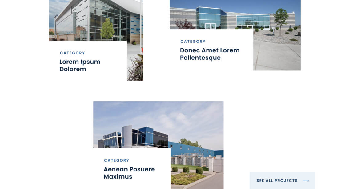
Next, we got to work on sketches and homepage concepts. From these concepts, some themes emerged, like the ample use of negative space. Many of their competitors made good use of negative space to show off their work and create a modern look and feel and incorporated that in our approach as well. Text blocks overlapping images along with the use of angles throughout were other motifs that complemented our keywords—modern and innovative by introducing visual dynamism. Shifts in their colour palette were also happening simultaneously as new print materials were being developed. Darker and richer blues replaced their warmer blues to extend the maturity and trustworthiness of their brand.
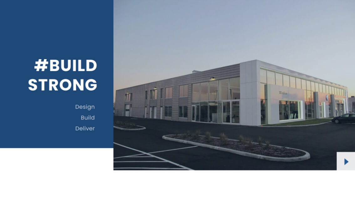
After some more iterating the homepage content and look and feel was established. It introduced who they are, what they do and most importantly their work to users in a modern and visually interesting way.
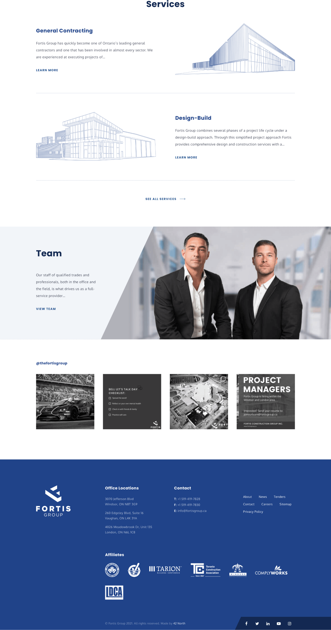
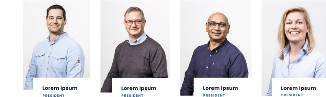
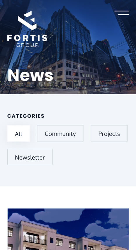
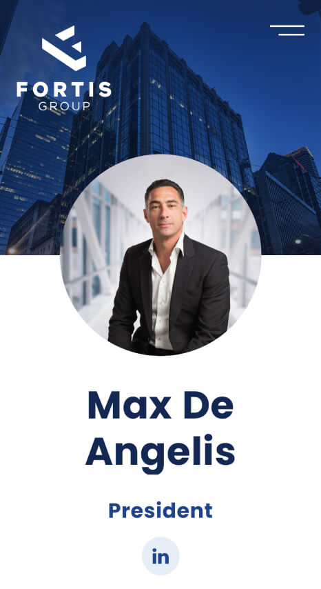
We applied this new look and feel to other pages reusing elements and patterns where suitable to create a cohesive and consistent look. The text blocks overlapping images component and variants of it were used across project, team and news pages. This component in particular was designed to be flexible to accommodate different amounts and types of information.
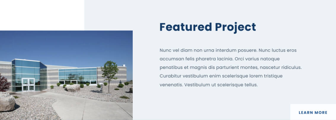
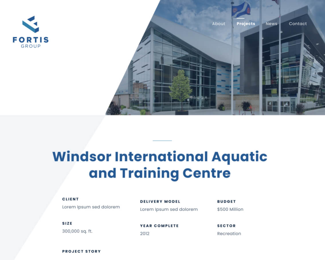
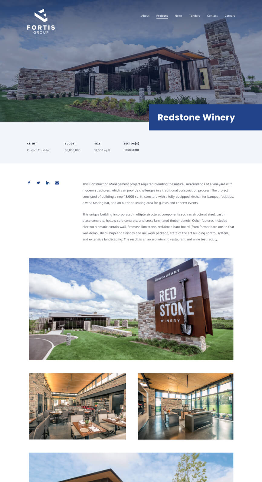
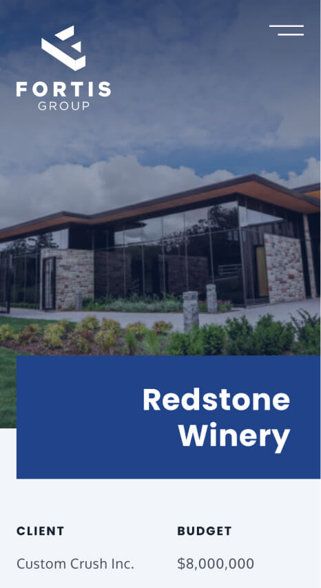
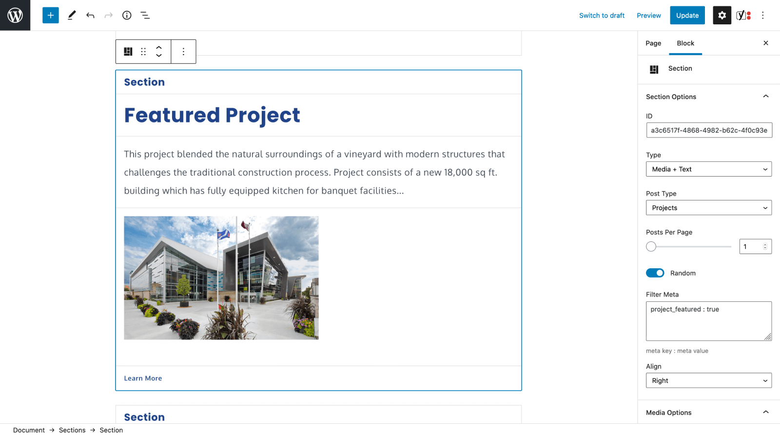
With individual project pages, we were working with a blank canvas as their existing site didn't have any. Based on what we saw on competitor sites and the importance of displaying the quality of their work we opted for a simple easy-to-follow layout with key information like budget, size, sector, client and project description at the top and images of the final outcome below.
Development
We took inspiration in some aspects of content development and visual design from competitor sites, but differentiating Fortis Group from their competitors was also important. Animations were a great way to achieve this. They also help add to the presentation of their work and team and help create a sleek and impressive feel overall. Below are samples of animations at work from a unique page loader to page transitions to reveals on scroll.
Towards the end of the project many forms grew from a few inputs to several groups of inputs. This meant including more input types and flexibility in laying them out to accommodate more complicated forms for launch and for the future. We made fields more flexible on the front and back-end to achieve this.
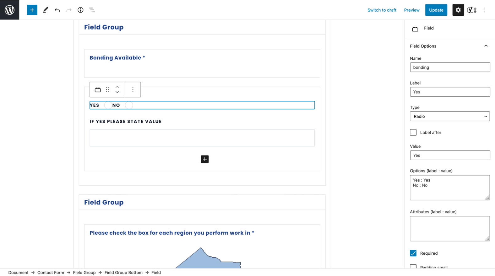
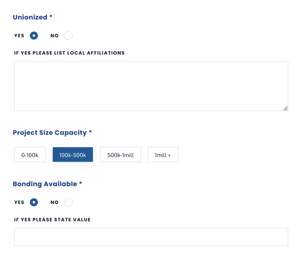
Creating an easier to manage backend was another important aspect to this project. We created custom post types for projects, tenders and careers and used custom fields and custom blocks, introduced by the Gutenberg block editor to offer flexibility and ease in choosing and laying out elements throughout.
The Outcome
Stakeholders were extremely pleased with the updates to the look and feel as well as the content on the site. It represented who they are, the quality of their work and company in a way they were proud to share. Updates to the website management experience were also a welcome improvement.
Explore more work
Injury Board
UI design + Web development
Later Newsroom
UI design + Web development