Later Newsroom

Overview
- Year
- 2022
- Team
- Web Manager
- PR Manager
- SEO Manager
- Copywriter
- Graphic Designer
- Web Developer
What is Later?
Later (formerly Latergramme) started in 2014 as an Instagram scheduler. It has since evolved into an all-in-one social media marketing platform with over 7 million users. Their tools help small business owners and creators plan, schedule and monetize their social content.
The Project
Design and develop a dedicated space on later.com for all press related information.
The Brief
Context
The communications team spearheaded this project around the opportunity to be more in control of the company brand and narrative by having a definitive, trustworthy source of company news for journalists and influencers. They also often handled inquiries an online newsroom could easily answer, which would be particularly helpful as they are a small team. Additionally, research on competitors' organic traffic from the demand generation SEO manager showed that all of Later's main competitors had newsrooms with good page authority scores and organic traffic levels increasing year over year.
Goals
- Increase organic traffic and domain authority
- Decrease unnecessary inquiries to communications team
- Long term – improve brand perception to potential and existing customers and investors to help drive growth and revenue
The Process
Wireframes
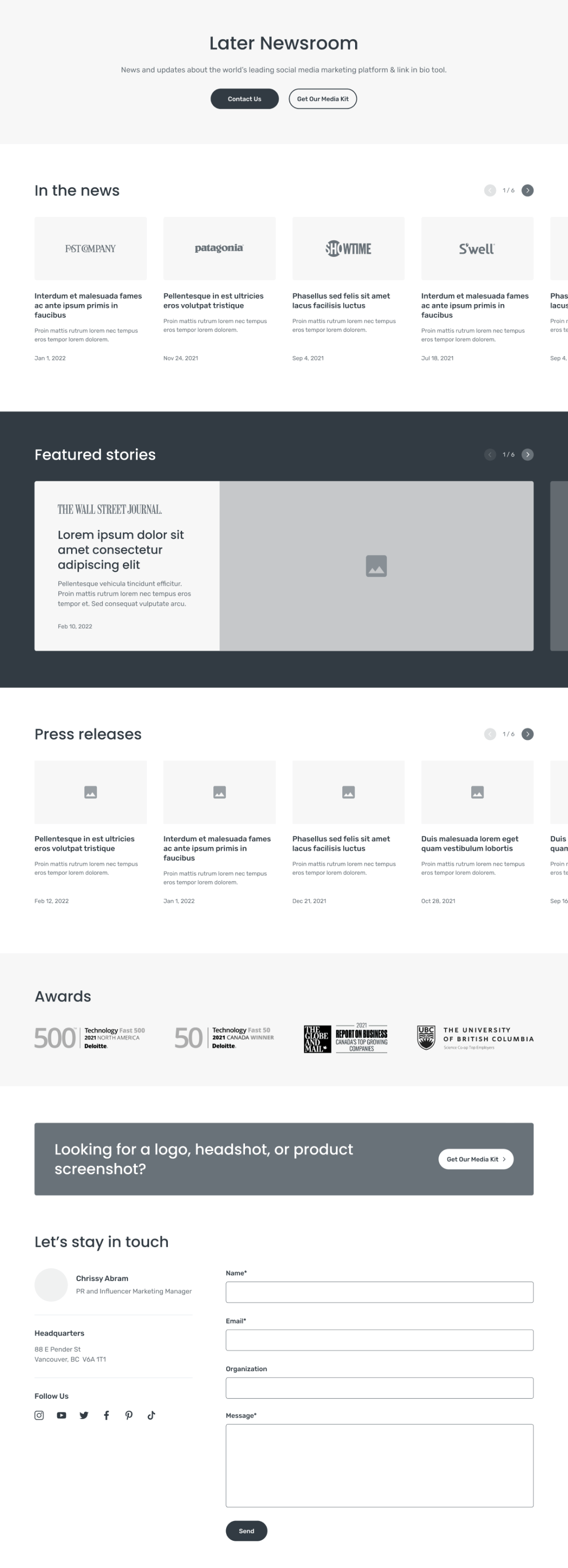
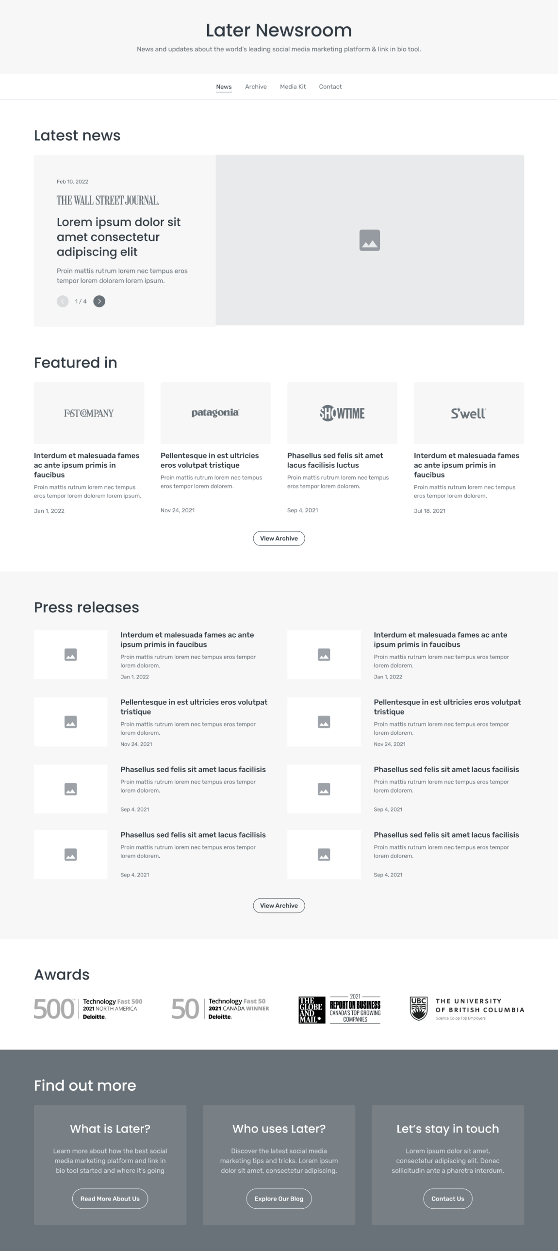
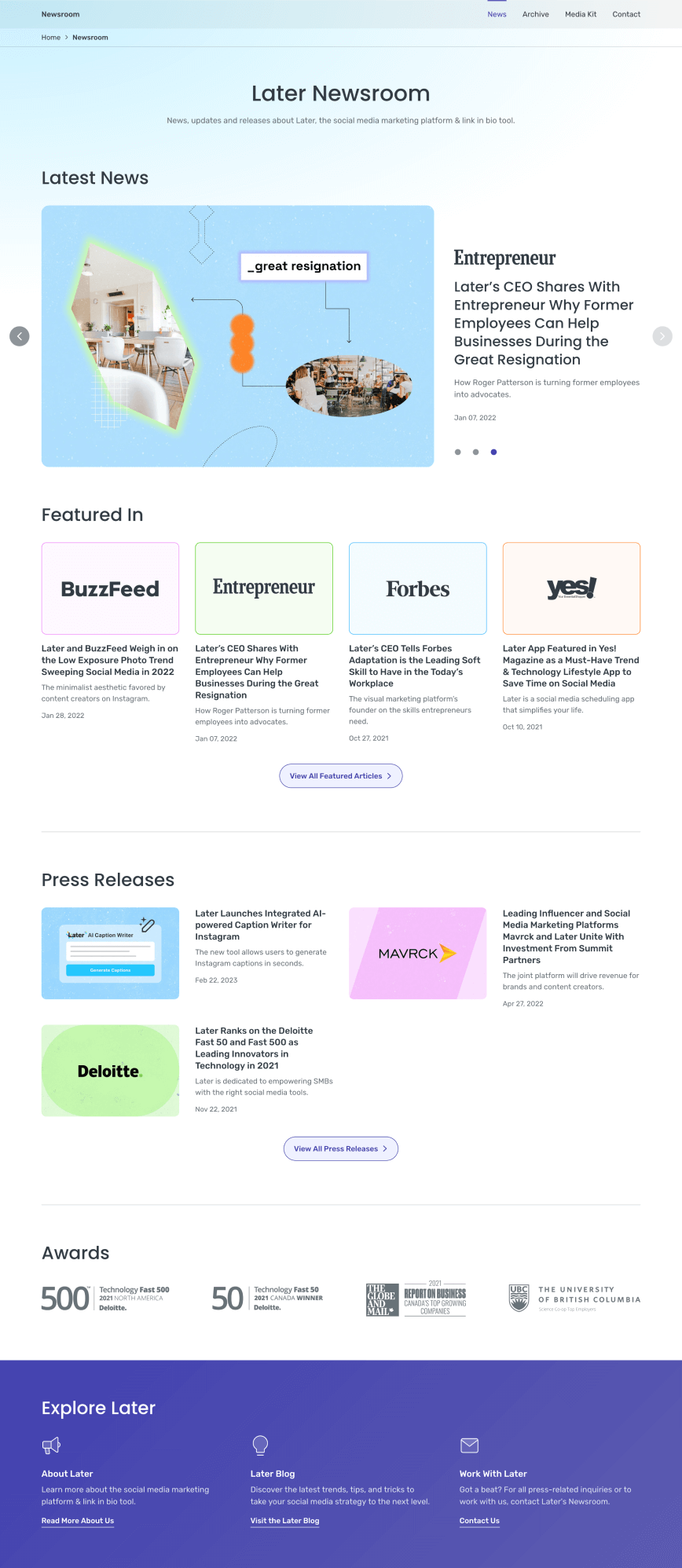
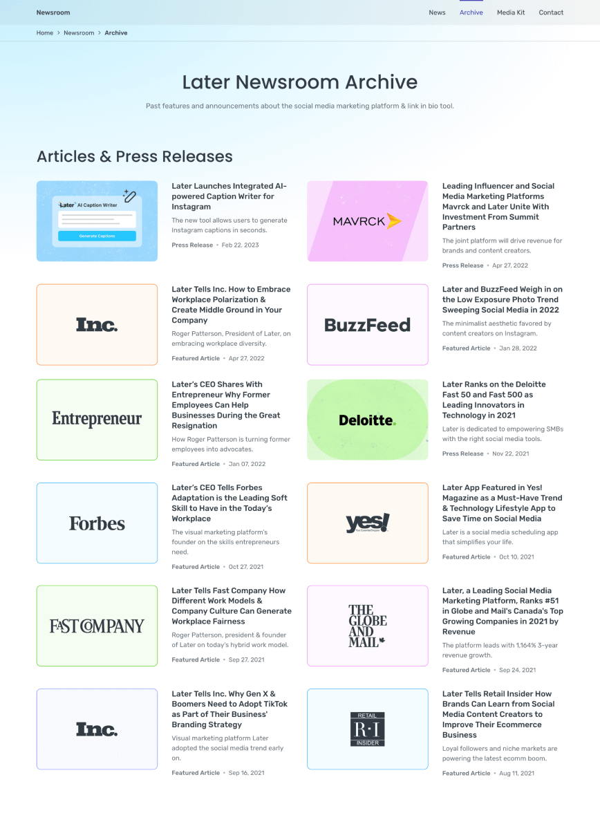
Communications and SEO stakeholders initially imagined the newsroom as a single landing page as they wanted to keep things simple. But once we put their content outline into a wireframe it became apparent the page was trying to do too much by placing all articles in continuous sliders and including a full contact form. To avoid information overload we suggested dividing it up into a few pages accessible by local navigation. This way content on each page can be more focused but also flexible as the newsroom evolves.
Visual Design
Design System Enhancements
We aimed to reuse as many existing components as possible so used this project as an opportunity to improve and standardize components like the secondary navigation, secondary buttons, hero, cards and form elements. Most of the updates were centered around consistency with spacing (following an 8-point grid system), more intentional use of colour like sticking to dark purple as the main interactive colour as well as following text contrast and non-text contrast accessibility guidelines. Prior versions of the hero and secondary buttons had poor contrast like light pink on white and vice-versa. In the new versions, hero text is charcoal and dark grey and secondary button text is dark purple as they all have contrast ratios of at least 4.5:1.
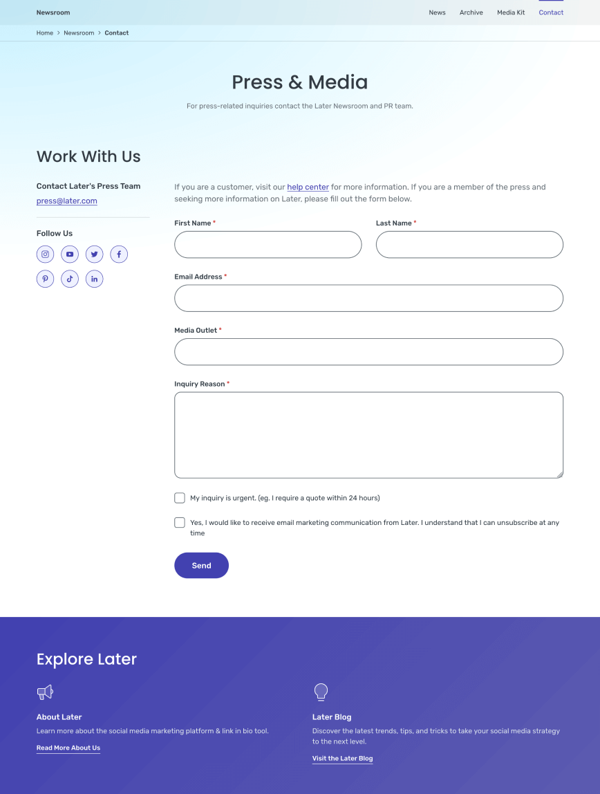
During this project we also learned about non-text contrast guidelines which specify that all interactive elements have a contrast ratio of at least 3:1 against adjacent backgrounds, which helps make interactivity more obvious to users. The initial design of the contact form had light grey inputs, which had an abysmal 1.17:1 contrast ratio against white. To fix this we updated all inputs to use high-contrast borders instead of backgrounds to indicate visual boundaries. We also made subtle improvements to error messaging like including an error summary at the top of the form and moving input error messages into their labels for better readability and semantics.


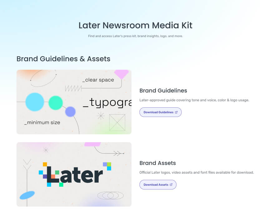
Graphics Art Direction
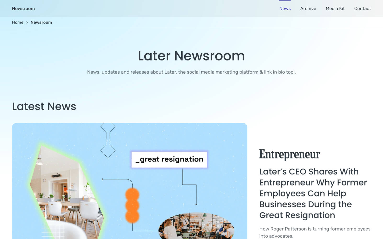
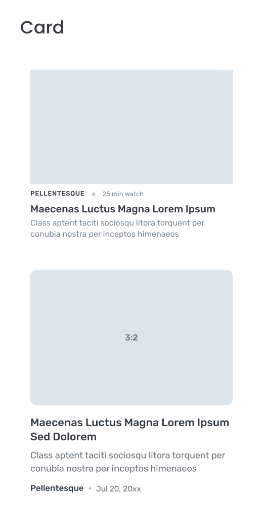
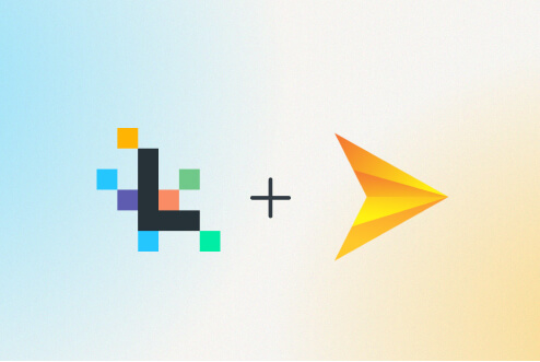
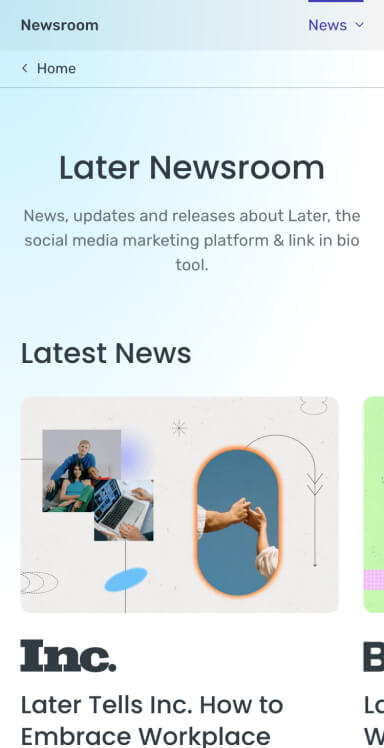
To start we reused thumbnails from the original news articles but variability in quality led us to create custom graphics. Our first pass at creating these graphics was based on an existing art direction for social media posts. Feedback from the creative team indicated that a custom direction was more suitable as the newsroom is a distinct part of the site. They put together a flowchart inspired design to show the link between Later and the media in a professional but playful way that better fits Later's fun brand identity.


Development
I was initially tasked with leading design on this project but due to changes on the team also took on more front-end development tasks. One of the main tasks was creating the slider of featured news articles at the top of the newsroom landing page. While sliders typically have many technical accessibility issues associated with them we looked at examples like product sliders on apple.com and carousel patterns from the W3C ARIA guides that use tab roles and structures to control and communicate slider state. We mapped this out with annotations (adapted from Indeed's A11y Annotation Kit on top of the visual design to consider and break down the interaction into focus states, reading and tabbing order, roles and labels before jumping into development. This was a helpful reference throughout implementation.

The other development challenge was validating and processing the contact form. Later.com is a static site with only third-party generated forms. The first version of the form was created with Klaviyo, but substantial issues like lack of support for textareas and unreliable email delivery to one contact presented us with the opportunity to create our own forms and implement the form element improvements made in visual design. The additional time taken in this phase was well worth it in terms of better user experience–performance, usefulness of error and result messages and style consistency versus third-party forms. And also team development–learning about and implementing serverless functions, the honeypot anti-spam technique, autocomplete tokens as well as keyboard and screen reader testing.
The Outcome
In the months after the newsroom was launched most short term SEO goals were met. Organic traffic was comparable to Later's main competitors and exceeded expectations. Backlinks also surpassed initial targets. Domain authority didn't increase but stayed around the same value. Similarly, page authority was average. Overall, these metrics indicate the newsroom met and continues to meet genuine user interest.
Internally, the improvements to the design system from this project helped streamline other projects as many updated components were easy to reuse with little adjustment. One example is a project updating resource landing pages to a simplified version of the newsroom landing page as part of an ongoing effort to clean up old styles and have a more consistent visual language throughout the site. More importantly, stakeholders were extremely pleased with the end result. From the PR Manager:
"Great work team! Looks amazing! The best I have seen when it comes to press pages!"
Explore more work
Why We Serve
UI design + Front-end development
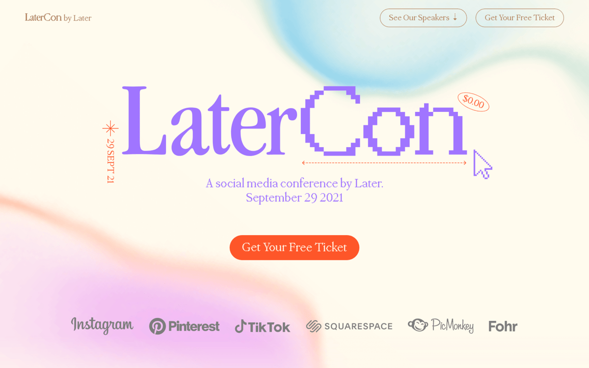
LaterCon
Front-end development