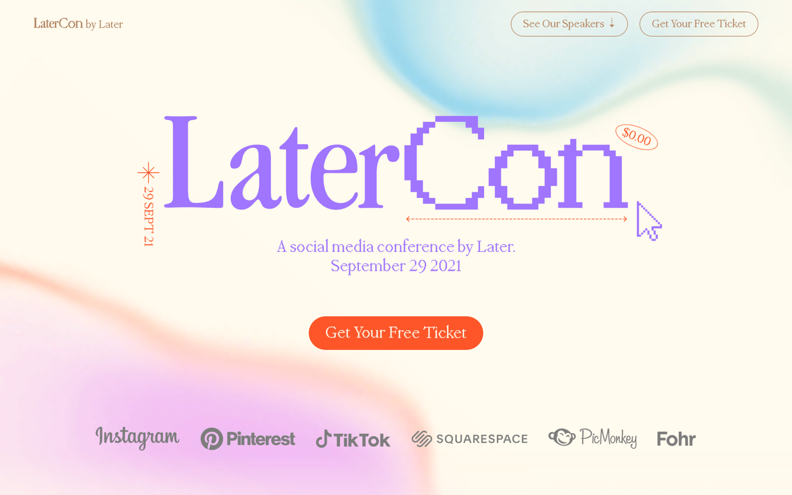
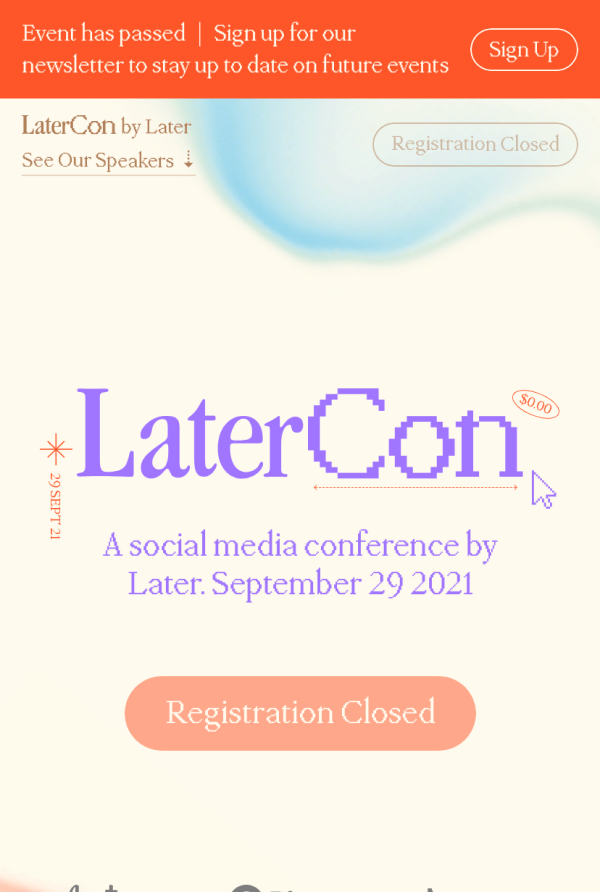
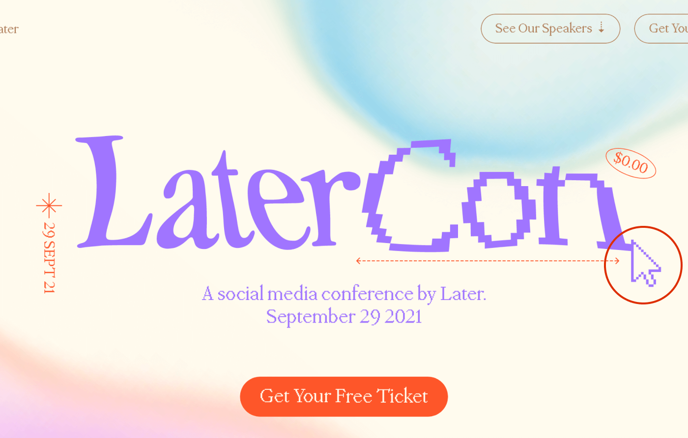
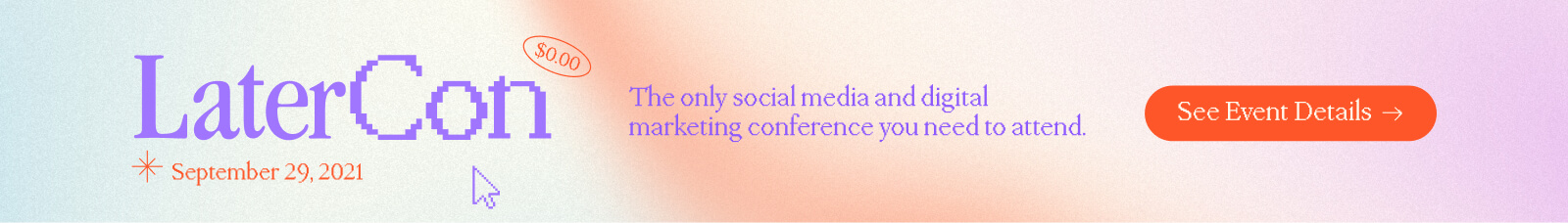
LaterCon

Overview
- Year
- 2021
- Team
- Operations Manager
- Campaign Manager
- Project Manager
- Creative Director
- Copywriter
What is LaterCon?
LaterCon is a free educational one-day event run annually and virtually by Later (an all-in-one social media marketing platform) to help small business owners learn how to grow their brand on social media.
The Project
Develop a landing page on later.com to promote and drive sign-ups to LaterCon.
The Brief
Context
LaterCon is organized by Later's content marketing team. After months long planning and preparation they were looking to have a landing page created to announce and promote it. The Creative Director finalized a custom art direction the month before and was in the process of completing the landing page visual design, which left a timeline of a little over two weeks to complete development. Expectations were also high for this year's LaterCon as the previous year saw a 60 percent increase in sign-up and attendance numbers. The marketing team wasn't expecting to replicate 2020 success as the pandemic played a unique role in this, but set ambitious targets nonetheless.
Goals
- Contribute to overall goal of achieving 60,000 sign-ups amongst all channels (web, social and paid ads)
- Get 100,000 unique page views
Requirements
- Include prominent calls-to-action encouraging visitors to register
- Launch by August 24th
The Process
Design Feedback and Handoff
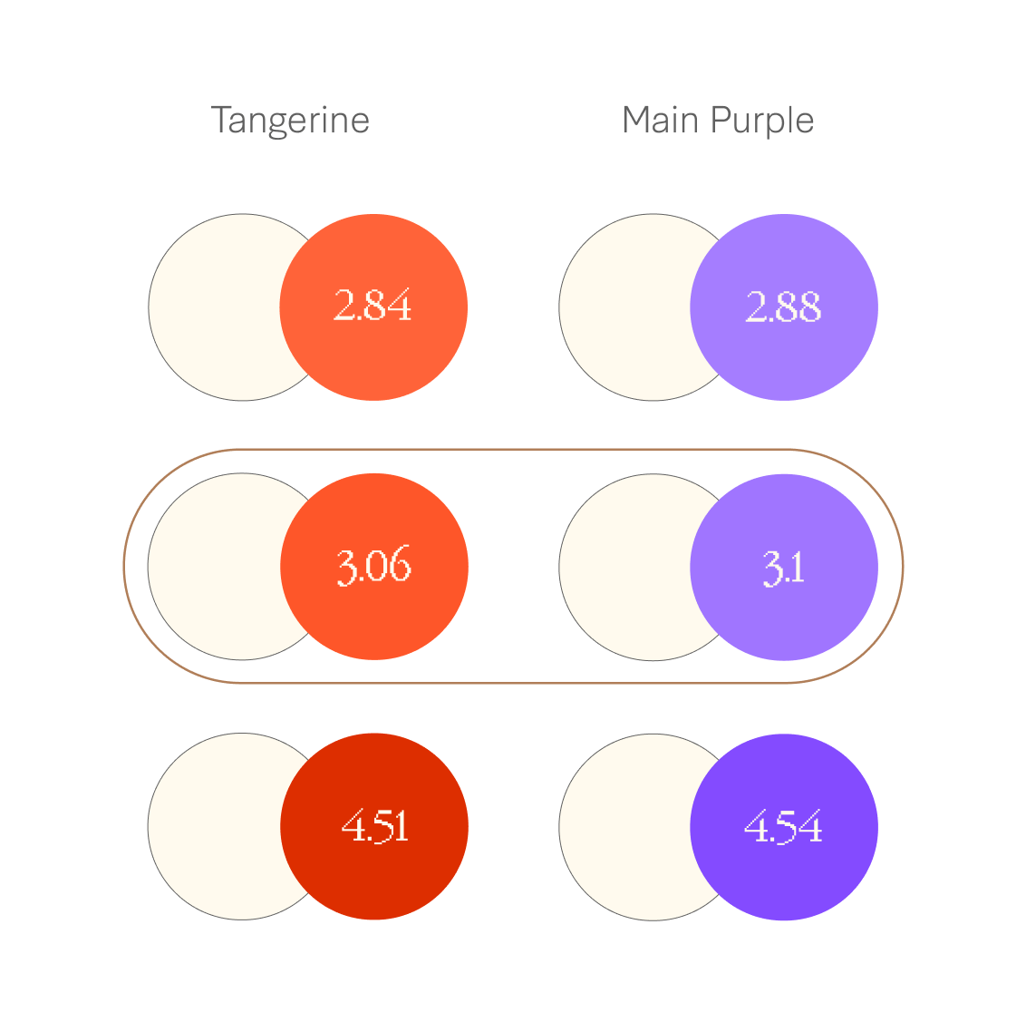
Before jumping into development there was time to provide feedback on the visual design. The overall design had great rhythm and structure but there were some contrast issues with two of the main colours. Both the tangerine and main purple had contrast ratios of less than 3:1 against off-white. We initially pushed for 4.5:1 versions to cover all text sizes but the art direction was already in production so making this leap wasn't possible (which speaks to designing with contrast in mind from the outset) so we met in the middle with 3:1 versions.
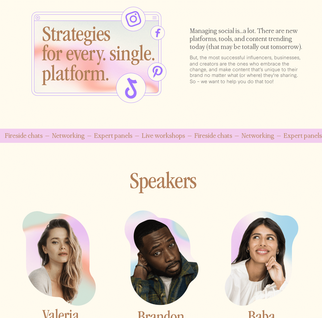
The Creative Director was also very proactive in communicating her vision for the end result and checking in with us on what was and wasn't possible in order to prioritize tasks. The idea behind the art direction was to get audiences thinking about how they can keep learning, growing, and morphing–the most successful businesses and influencers are the ones who can keep moving and adapting to new platforms and situations. Fluid and reveal transitions and animations were highlighted as ways to reflect and elevate this idea on the live site. Text distortion and text reveal examples served as inspirational references as we got ready to start development.
Development
We started development in CodePen with the aim of getting something for stakeholders to review quicker. Later.com is a static Gatsby generated site. At the time, I wasn't very experienced with the React library so thought this approach would work best. However, the process of moving code over and site build factors (eg. global CSS interfering with LaterCon styles–Styled Components later circumvented this issue) was time consuming and diminished earlier gains.
As mentioned earlier, transitions and animations were important parts of the overall vision for the landing page. We started off small with button animations inspired by Codrops The slight scaleY and skew effects in these examples worked well with the subtle morphing quality we were looking to achieve. This formed the base for many on scroll transitions like the text reveals. In terms of accessibility, we made sure to respect users' motion preferences with reduced motion queries as well as hiding repetitive markup (eg. individual spans for letters) from the accessibility tree. We also tested it with JavaScript disabled (mainly for SEO purposes as search engine bots might not execute all JavaScript code) to make sure all content was still visible.
Default
Reduce Motion
JavaScript Disabled
Although stakeholders were pleased with how the page turned out, there were some things we didn't get to. The Creative Director was hoping for a mouseover distort of the LaterCon logo in the hero section. A combination of time and performance constraints resulted in a compromise. The effect required a large library and page speed was already in the orange. We opted for a smaller library and a simpler effect–clicking the cursor icon changes svg paths to simulate a morphing effect. We also encountered a significant hiccup the day before the event–the post-event version was pushed live. For about an hour registration links were disabled. This was a lesson to draft pull requests and better communicate with team members about time sensitive launches.
Homepage Popup
Two weeks after launching the landing page, the Demand Generation Director and Creative Project Manager wanted to better support event sign-ups. A quarter of the sign-up goal had been reached but there were only three weeks left. They settled on a homepage interstitial promoting the event. Although they'd already decided on a popup, we mocked up another option–a banner in the middle of the homepage as entry popups are quite intrusive and there are SEO penalties associated with using them on mobile (unless they're mandatory). The interstitial design won, but we only displayed it in viewports greater than 1000 pixels.

The Outcome
In post-event reports we fell short on some targets but still had notable wins. In terms of page views we only reached about a third of the initial goal at around 60,000 unique page views. For sign-ups we reached two-thirds of the original goal, but the landing page alone saw around 31,000 click-throughs to the registration page (we weren't able to get full attribution for completed registrations but can safely say the landing page converted well). The popup contributed to this as we saw a 300% increase in landing page clicks after its launch. We also saw significant improvements in average time on page and bounce rate in comparison to landings pages from previous years.
A few weeks after launch the landing page was featured on One Page Love, a design gallery showcasing the best single page websites, templates and resources. A lot of effort was put into this landing page by the team so it was great to be recognized by industry peers.

Internally the landing page also received lots of love from the marketing team. From the Operations and Editorial Managers:
"We cannot get over how cute the landing page is! So FRESH and eye-catching. Nice work team!"
Explore more work
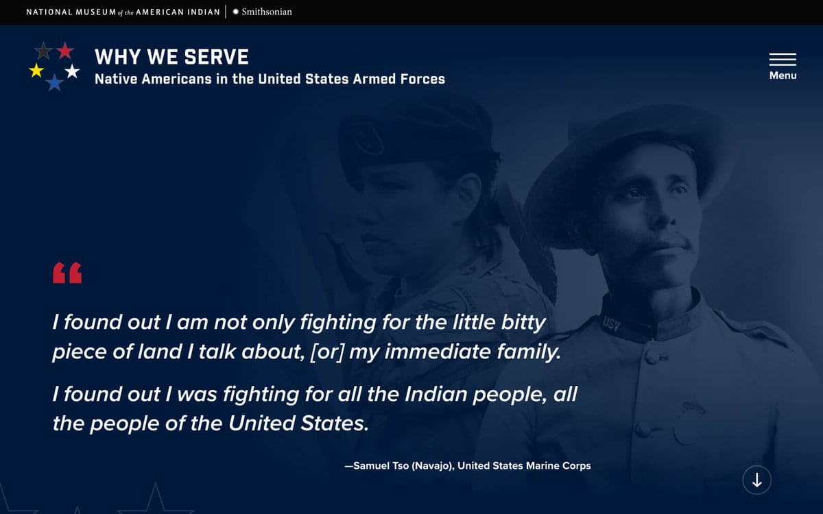
Why We Serve
UI design + Front-end development
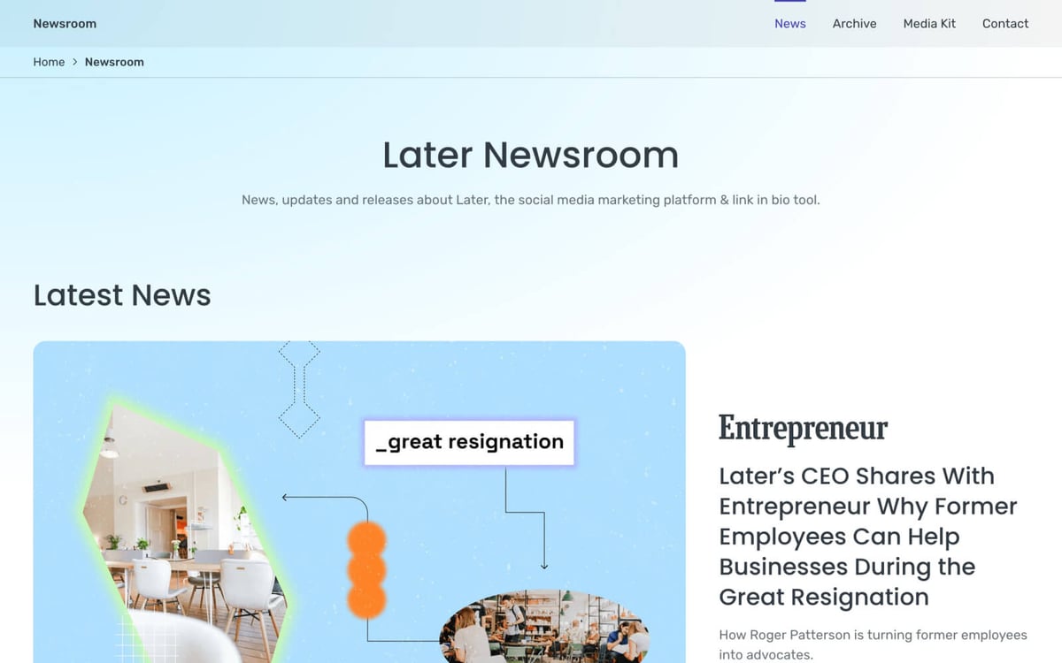
Later Newsroom
UI design + Web development