Injury Board

Overview
- Year
- 2018
- Agency
- Claris Marketing
- Team
- Marketing Director
- Back-end Developer
What is the Injury Board?
The Injury Board is an association of experienced trial attorneys practicing throughout the United States and the United Kingdom. Members are champions of the civil justice system and consumer rights. They are board certified attorneys as well as leaders of trial bar organizations.
The Project
Redesign and develop the Injury Board website.
The Brief
Context
The Injury Board was in the process of changing its rules of membership, particularly its system of acceptance and wanted the site to reflect this new direction. They wanted the new site to convey to users that members form an exclusive group made up of the best of the best and ultimately instill trust. Naturally, stakeholders voiced a desire for the site to stand-out in an elegant way.
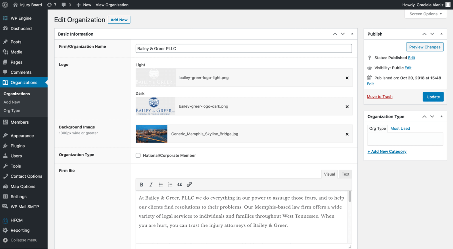
Overall, they wanted the redesign to make the site simpler, particularly the directory of firms and members. This not only applied to the back-end too. The existing site was built on a legacy framework that was becoming burdensome to manage. Creating a better experience for internal users to manage and update the site was also important.
Goals
- Convey to users exclusivity of membership and trustworthiness of Injury Board
- Simplify the site, especially dated and clunky directory of firms and members
- Create an easier to manage back-end
Guiding Keywords
From this brief and conversations with stakeholders we captured these keywords to use as our focus throughout all phases of the project:
- Easy-to-use
- Beautiful
- Elegant/sleek
- Trustworthy
- Exclusive
- Simple
The Process
Content
We initially started the design process with existing content on the site but quickly learned the voice of the copy needed to change in order to suit the new brand direction. The Marketing Director simplified the sitemap and provided us with fresh copy. The information architecture was now in a better place for us to begin designing in earnest.
Visual Design
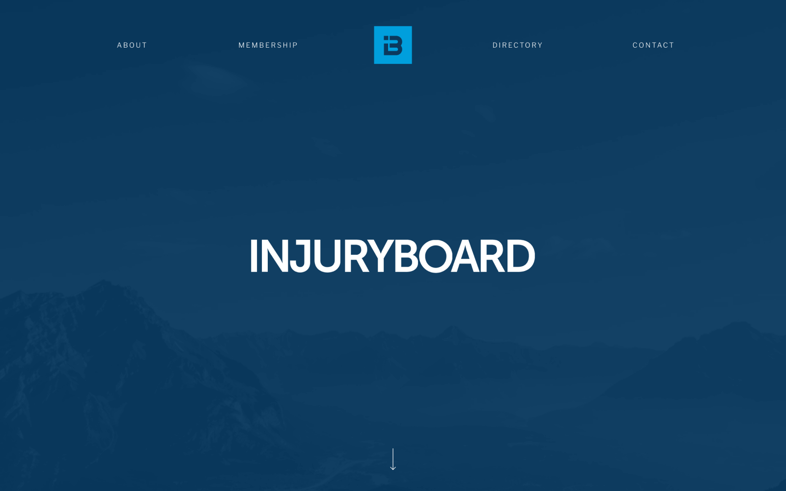
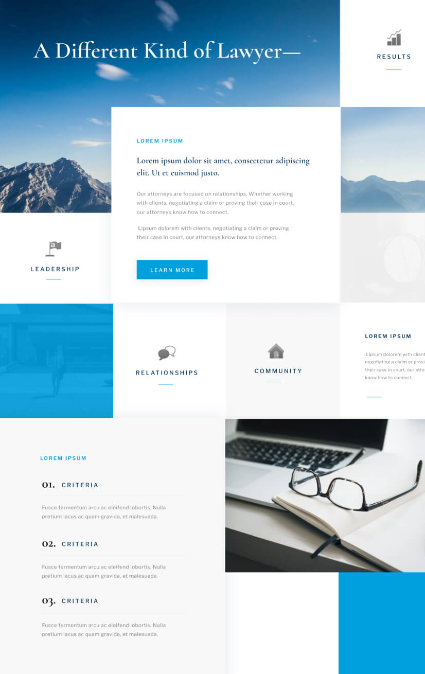
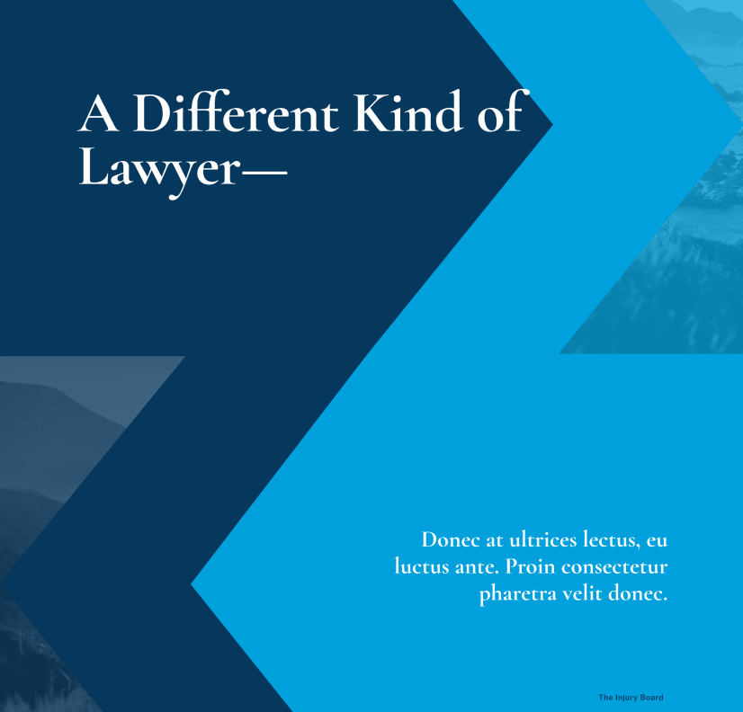
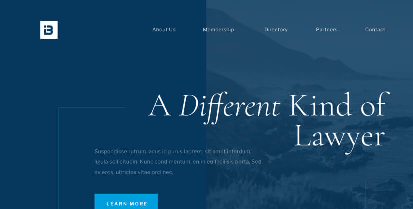
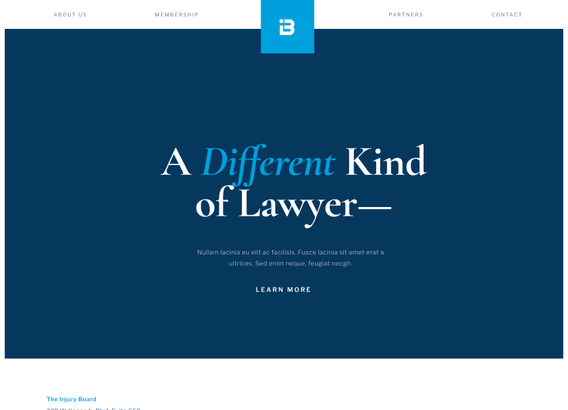
Some of our earlier experiments with homepage concepts didn't go to waste though. There were some typographic and color palette choices that worked well in these early iterations. We introduced navy blue into the colour palette and made the main bright blue an accent colour for buttons and links. We also brought a serif into the typographic mix. Both of these choices worked well with the keywords of trustworthiness and elegance.
In collaboration with the Marketing Director and after more iterations we settled on a new look that was simple and elegant.


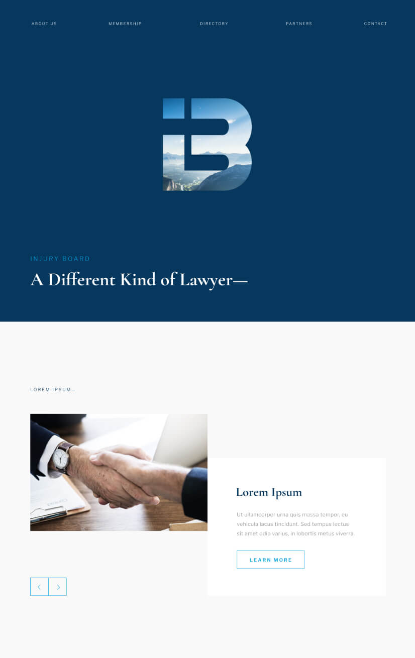
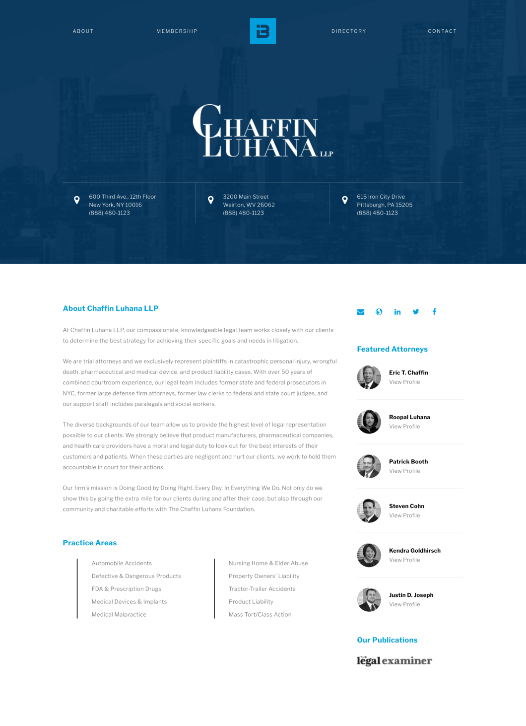
Across other pages on the site we applied these same principles. Firm pages were updated to give content previously squeezed into a tight three column layout more breathing room for easier scanning for users. We also needed to consider flexible layouts that would be balanced regardless if firms had one to multiple addresses, attorneys or social media channels and various lengths of copy for any given section.
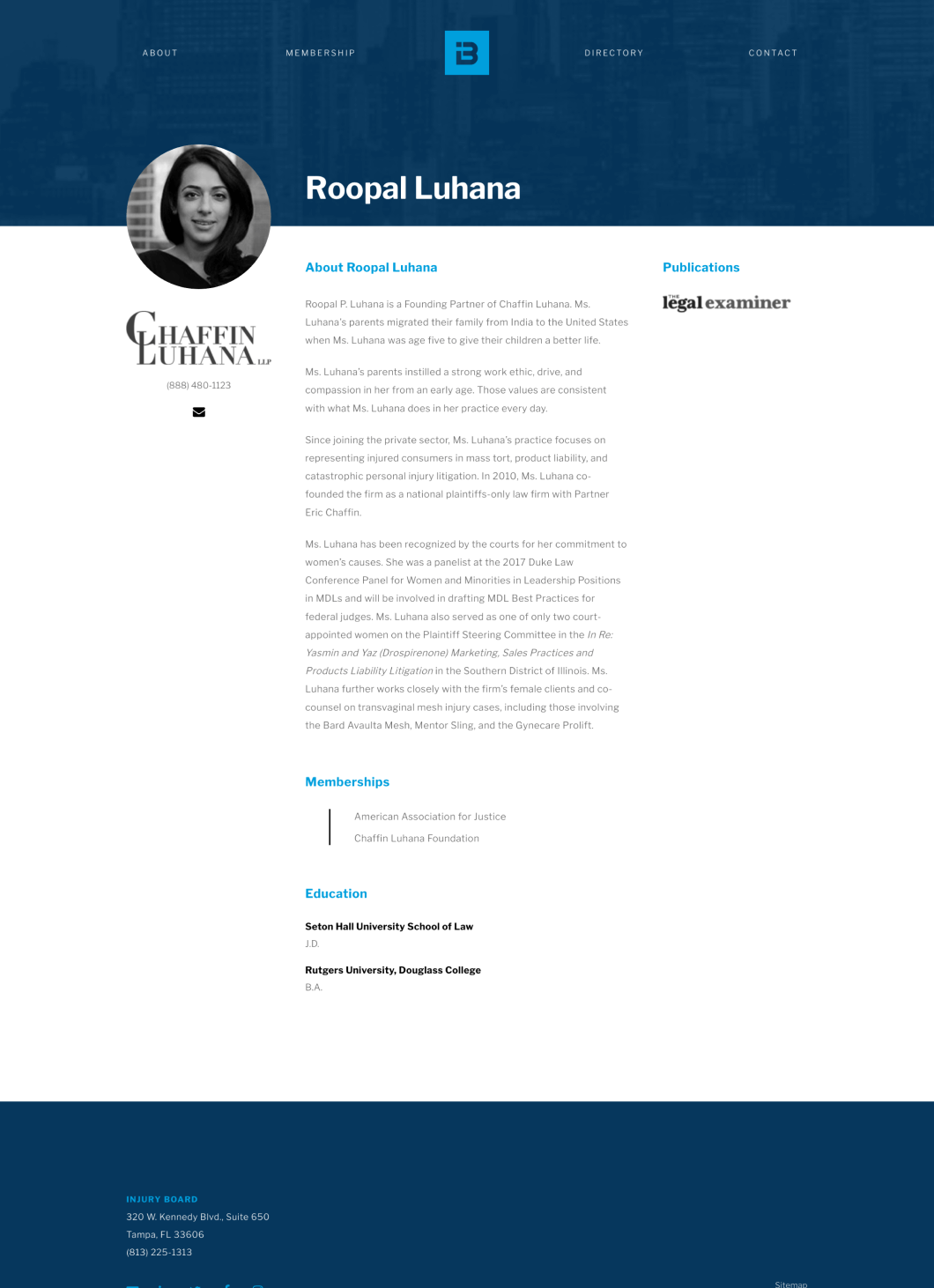
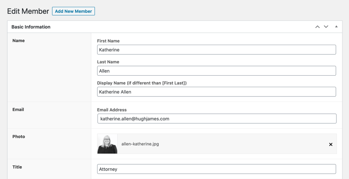
This also applied to member pages with varying lengths of information provided for bios, roles and memberships.

Development
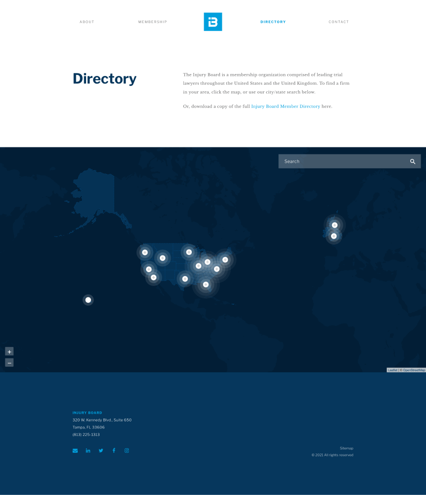
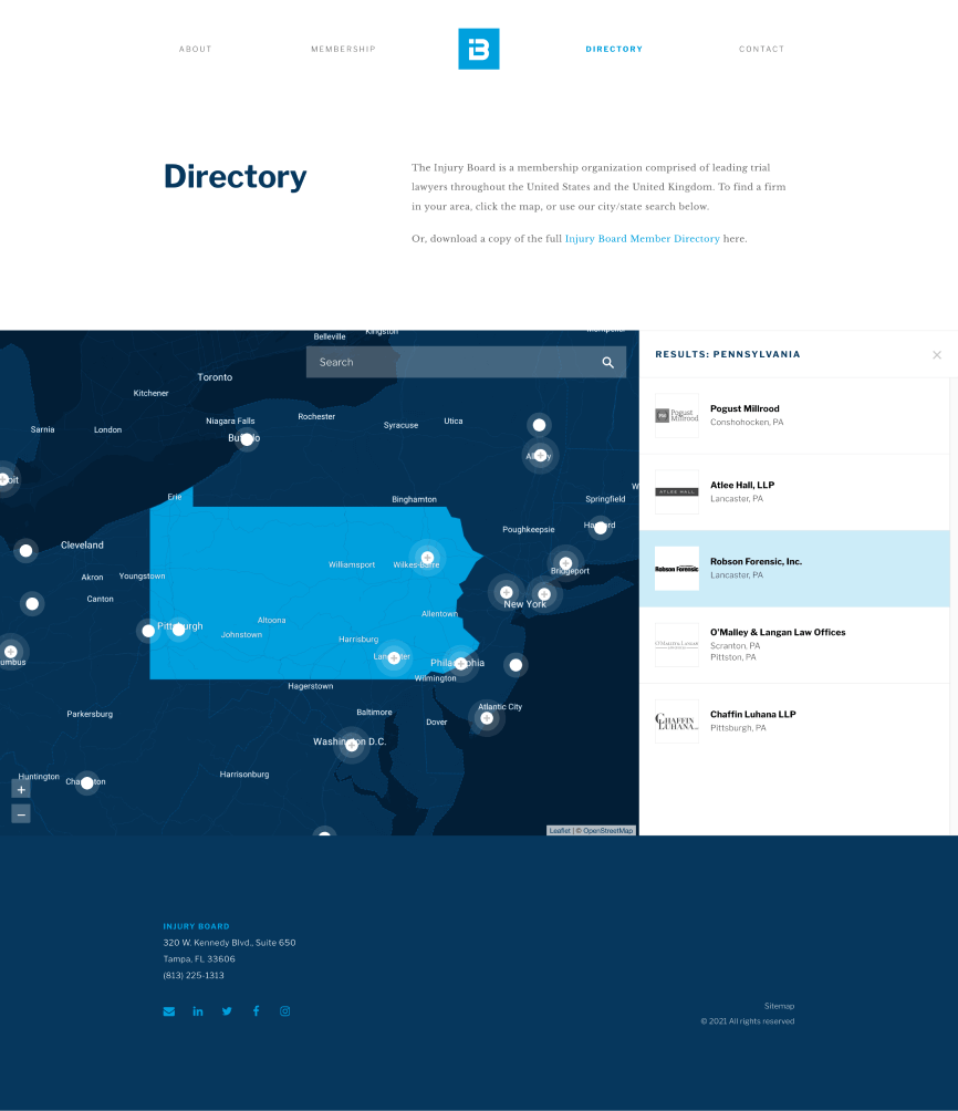
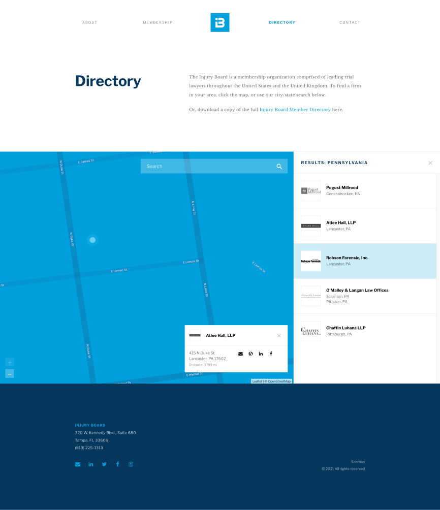
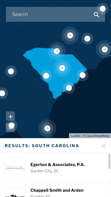
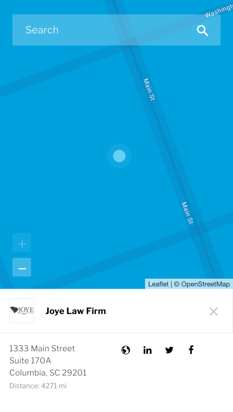
We applied this new look to other pages like the directory. The existing site used a standard Google Maps embed to search and show firms. It was cluttered with the number of markers and extraneous icons. Given the emphasis on simplicity we streamlined the map to outlines of countries, states and cities and street names at higher zoom levels to avoid information overload. The map was also a good opportunity to introduce greater interactivity to create a stand-out experience stakeholders had voiced as being important earlier in the project.
Using the Leaflet and Algolia libraries we created a map with selectable states and clusters and a simple search bar with autocomplete. This reduced the clutter for a cleaner, more intuitive UI that allows users to find what they're looking for in an exploratory way. Improving the display of results was also key to creating a more intuitive UI. Previously, the results were displayed on a separate page. We removed that extra step for users in the redesign by showing results in a sidebar to the right and below on mobile devices.

Creating a stand-out experience with the use of animations and transitions expressed by stakeholders also formed a key part of the implementation stage. Reveals and subtle fades when elements were visible in the viewport were used to complement the content and elegant look we were seeking to achieve while not being distracting or overdone.
As outlined earlier, creating a good experience for internal users was also a priority for this project. As an organization experienced with WordPress, moving to that platform was a natural next step. We create a custom WordPress theme with custom post types and fields for firms and members and arranged them into intuitive sections for non-technical content editors to fill in the necessary information with ease.
The Outcome
Stakeholders were thrilled with the new look and feel of the site. It complemented the new brand direction well and created an elegant and easy-to-use experience they were seeking. Feedback from individual users and members after launch was positive. They noted the improved look and more importantly, found it easier to find the right attorney for their needs.
Explore more work
Fortis Group
UI design + Web development
Why We Serve
UI design + Front-end development