Puffin Innovations

Overview
- Year
- 2022
- Team
- Web Developer
- Accessibility Tester
What is Puffin Innovations?
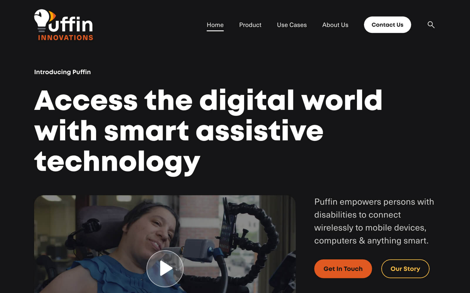
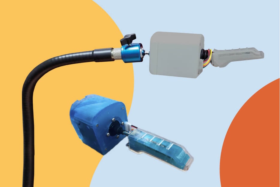
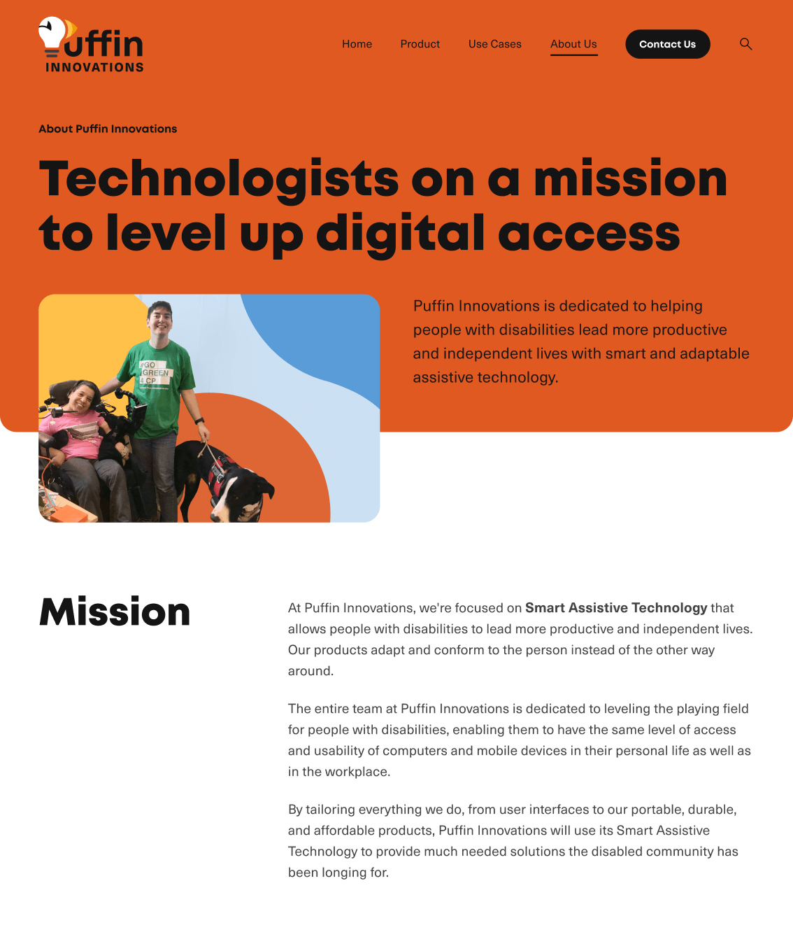
Puffin Innovations is a smart assistive tech startup dedicated to helping people with disabilities lead more inclusive and independent lives. It was founded in 2015 by Adriana Mallozzi, entrepreneur, innovator and disability advocate, after winning the Massachusetts Institute of Technology (MIT) Assistive Technology Hackathon with the creation of an innovative input device (Puffin) that connects to and operates smart devices. It's a game changer for many people with physical disabilities to engage in everyday activities independently.
The Project
Redesign and develop Puffin Innovations' website to be more accessible and better reflect their mission and values.
The Brief
Context
This project was completed as part of Knowbility's Accessibility Internet Rally (AIR), an annual competition that aims to educate web professionals on creating more inclusive websites by pairing them with mentors, nonprofits and community organizations to redesign and develop their sites to be, first and foremost, accessible. Groups have two months for discovery, design and development. Sites are mainly evaluated by specific criteria from the Web Content Accessibility Guidelines (WCAG) but digital accessibility is more an art than a science and technical conformance is just one facet.
Users
- Primary – people with a form of paralysis and/or limited to no mobility in their upper extremities and organizations with funding for assistive tech like independent living, vocational rehabilitation, or higher-educational institutions/organizations.
- Secondary – parents, clinicians, educators and assistive technology professionals.
Goals
- Differentiate themselves from competitors particularly ease of use, portability, and customization capabilities
- Learn more about/from primary users to further develop product and connect with organizations with assistive tech budgets
- Long term – attract investors to help drive growth as shift away from crowdfunding
Guiding Keywords
From this brief and quick interviews with stakeholders we captured these keywords to use as our focus throughout all phases of the project:
- Accessible
- Clear
- Distinct
- Bold
- Creative
The Process
Wireframes
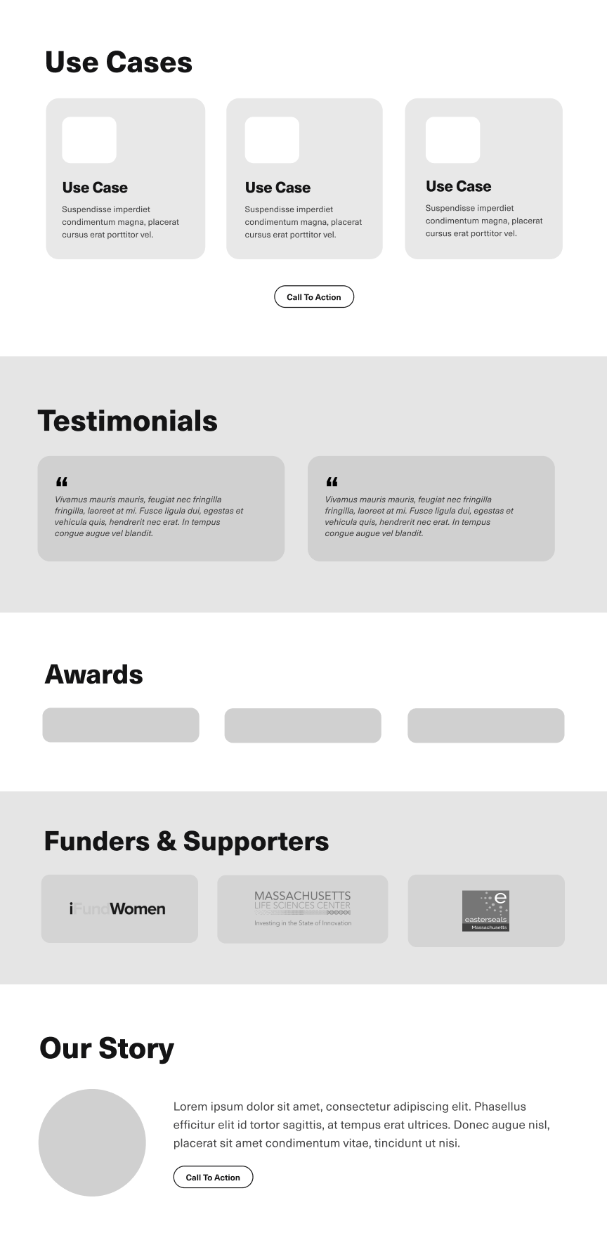
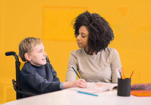
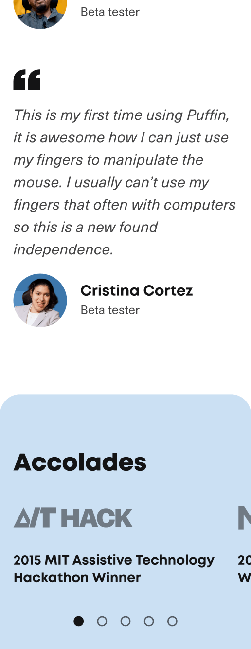
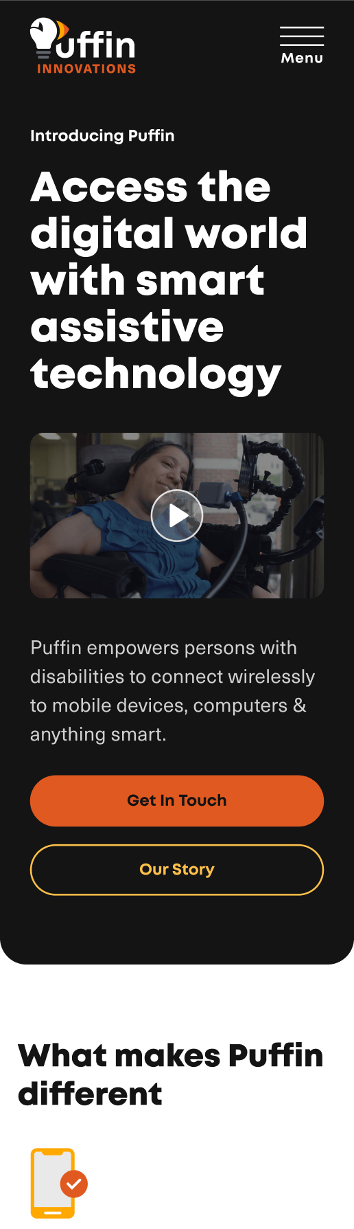
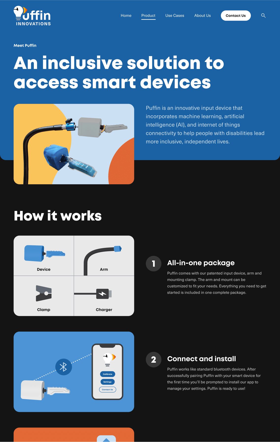
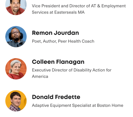
The existing site was sparse on overall content and a requirement for AIR was to submit 6-10 pages for review. We used their marketing materials to add new sections like how it works, use cases and product and company differentiators to communicate their value and distinguish themselves from competitors. We also added testimonials from their social media content and kept the logo bar of supporters and professionally made video showcasing Puffin and Adriana's story as ways to inspire trust in new users.
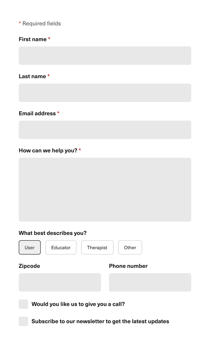
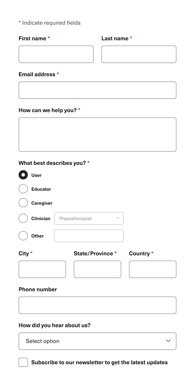
In terms of learning more from primary users we extended their existing contact form to include role and location to get a better sense of where/who is generating the most interest in their product. This was also good information to prepare for calls and tailor email content to keep potential leads interested regardless of their ready state.

Visual Design
Logo
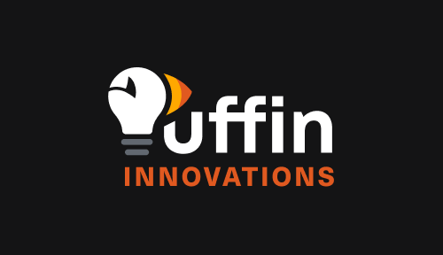
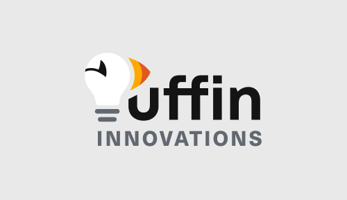
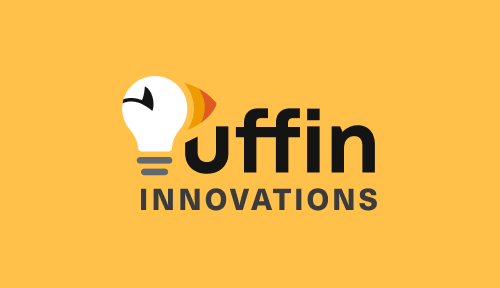
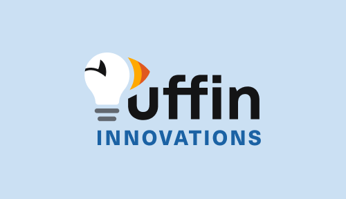
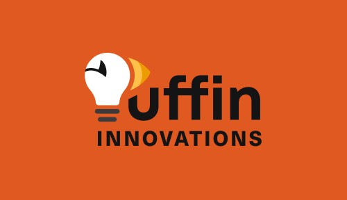
In tandem with wireframes we also worked on updating the logo. The existing logo didn't scale well and was difficult to read. The team was open to seeing new ideas as long as the puffin was prominent. Early explorations were too generic and used pastel tones that didn't fit the bold and distinct look they were seeking. For the final version, we used more vibrant colors and were more intentional in evolving the original puffin brandmark. We also made sure all text portions of the logo have 4.5:1 contrast. The result was a more readable, flexible and scalable lockup that better reflects their growing organization.


UI design
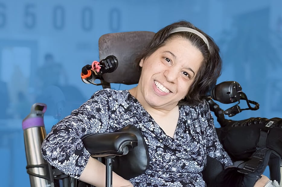
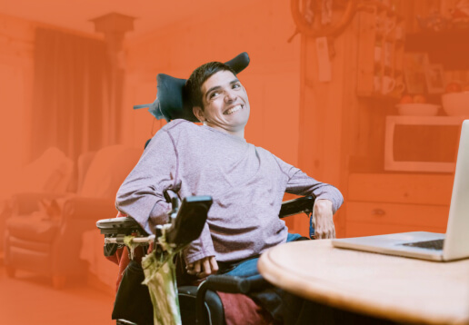
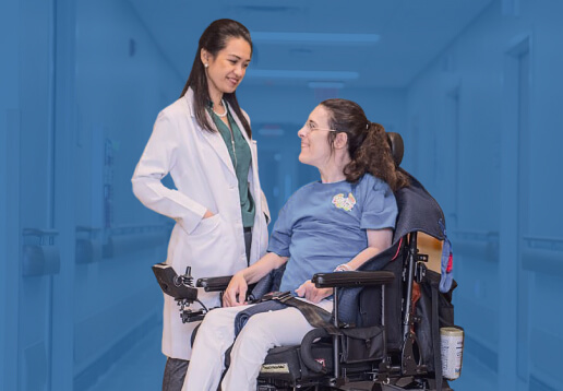
Continuing the bold and distinct look from the logo we chose large type sizes for both body text and headings and large touch targets for interactive elements like buttons and form fields, which was fitting for meeting accessible target size guidelines as well. This paired well with the rounded, colour-block look in the design of overall sections, graphics and illustrations. High resolution product photos were unavailable at the time so flat illustrations and cutouts for photos worked well to meet this limitation while complementing the vibrant theme.
Development
Theme
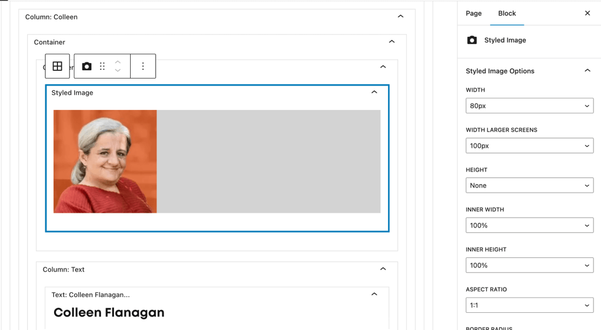
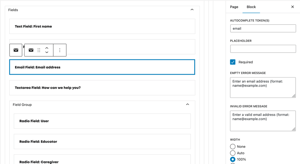
The existing site was built on WordPress with a theme they put together quickly and AIR provided hosting for WordPress. With this in mind a new custom WordPress theme was the best choice. The new theme was built with my starter libraries WP Theme Formation and Formation for front end components to get started quickly and reuse updates across other projects. For example, form creation and validation, configuration and focus management improved across these libraries as a result of this project. In terms of ease of use and maintenance, we used server side rendered custom Gutenberg blocks for maximum flexibility over markup. Everything from contact form fields to media text containers are fully editable.
Testing
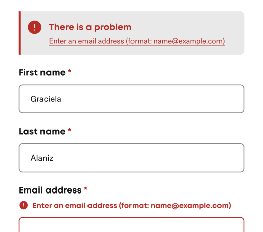
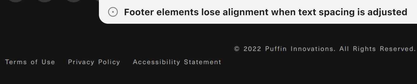
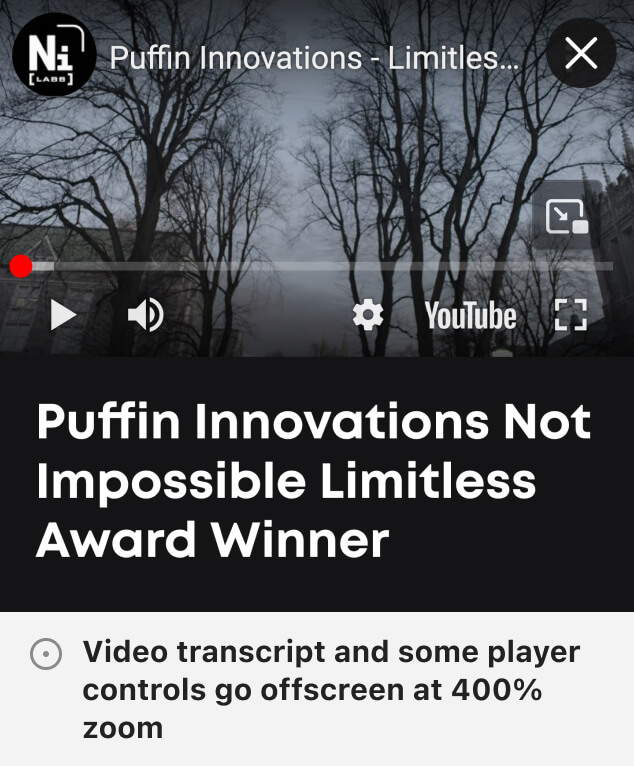
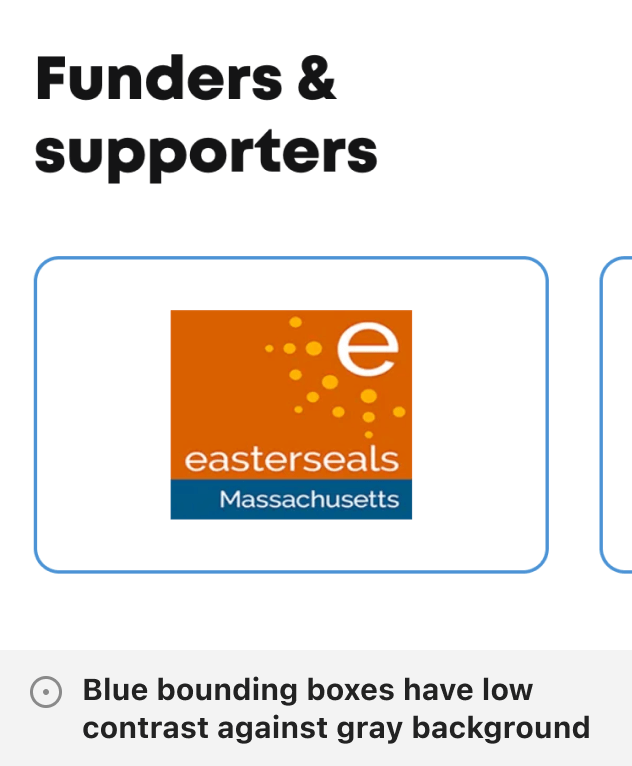
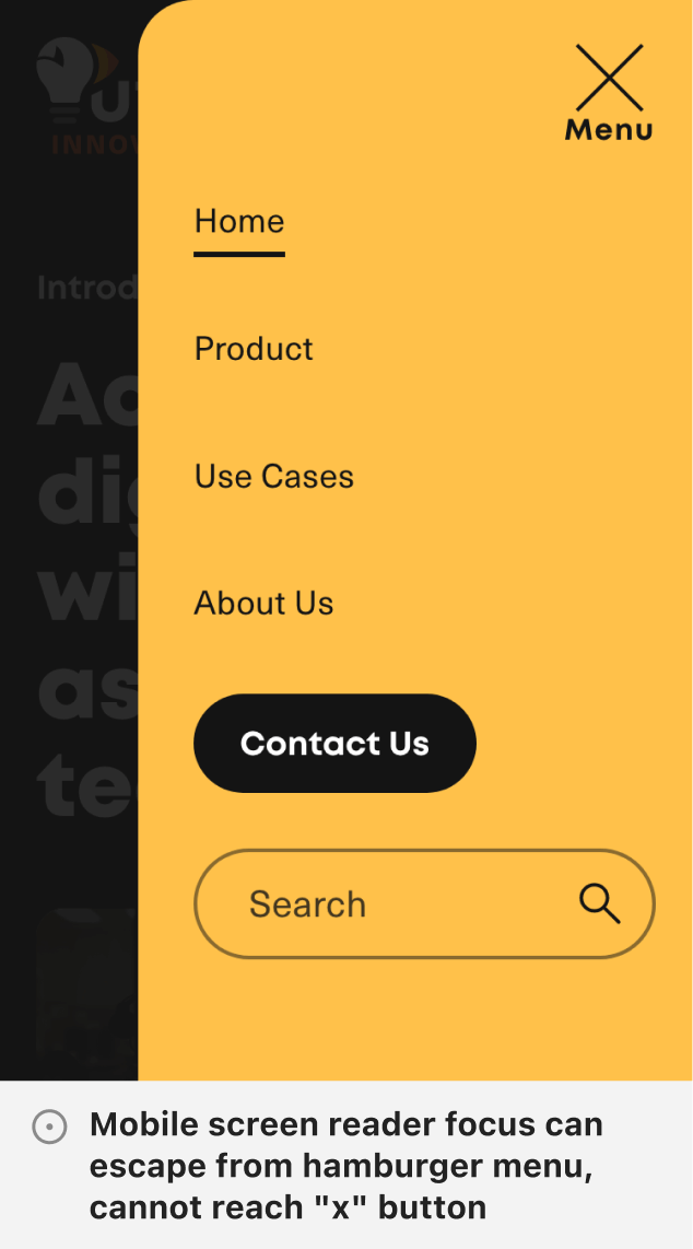
Most accessibility testing was done manually apart from axe DevTools scans and text spacing bookmarklet tests. Screen reader testing was Voiceover biased from team member devices. Although non-comprehensive this phase provided many learnings. Quite a few bugs related to resize and reflow taught me that content should be understandable without scrolling in two dimensions within a 320 x 256 viewport (except elements like maps) and to check against different default font sizes to make sure user settings are respected. I also learned the importance of headings starting sections to maintain a clear content hierarchy. Focus management was also another area that proved a bit challenging particularly with interactive elements in modals resolved mainly with the newer inert HTML attribute. Autocomplete tokens in inputs were also a new learning I reuse in all forms now.
The Outcome
We received an overall 82% score from AIR judges, which includes technical accessibility and other factors like site appropriateness. There were a few trivial errors related to parsing but most feedback was helpful for user experience like avoiding automatically opening links in new tabs because the context change can be quite jarring for screen reader users for instance or improving the semantics of the slider navigation.
In the months after launching we also saw an increase in contact page visits and form submissions. Adriana shared positive feedback regarding the quality of leads as well as the overall design of the site and logo:
"This talented group took our input and flawlessly executed the vision — we wanted the new logo to convey INNOVATION, CREATIVITY, and of course, our fun-loving bird friend! In fact, the end result exceeded our expectations!"
Explore more work
HeyTony
UI design + Web development
Injury Board
UI design + Web development